build your

Nature's Symphony
brand
Approach
Get more out of your brand. We specialize in making distinctive logo designs that incorporate what your brand believes in.
Our expertise in color theory is aimed at reflecting your brand's personality and visual sex appeal. Create a harmonious and accessible typeface selection that speaks to your audience with clarity.
We further articulate your brand's narrative through a cohesive visual language and compelling imagery, ensuring a consistent and impactful brand presence across all media. To maintain this consistency, we provide comprehensive brand guidelines and style guides, serving as your blueprint for brand communication and application. Let us distill the essence of your brand into a simple, yet profound visual identity, all presented on a single, easy-to-navigate sheet.

concept
We craft a unique brand concept that encapsulates your company's ethos and distinguishes you in the marketplace

design
Our creative team translates your brand concept into visually-compelling designs that resonate with your audience.

refine
We fine-tune every design element, ensuring that your brand communicates its message effectively and memorably.

"I was astonished by the speed and efficiency of Develomark's work. They grasped my vision instantly, and I felt comfortable providing honest feedback. Any adjustments needed were made promptly, with no egos bruised. It was a collaborative effort through and through, elevating my initial concepts to something far more professional and effective."
Gina, The Network Salon
the devil in the details
Everything you need to know about our branding capabilites.
sample #1
An example of a recent brand guideline done for a dental office.
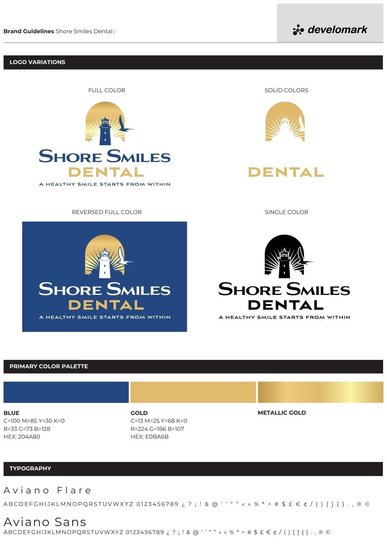
dental office:

full color
Good for use over a light background.

black
Good for use over a white background.

white
Good for use over a darker background.
sample #2
An example of a recent brand guideline done for a Pilates Studio.
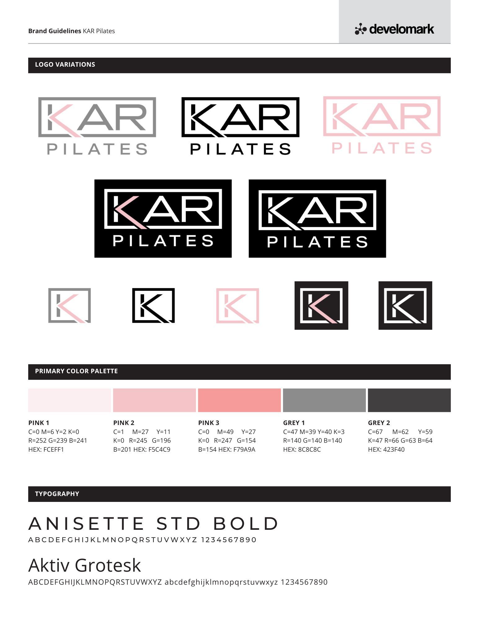
pilates studio:

full color
Good for use wherever you feel like it.

black
Good for use over a white background.

white
Good for use over a darker background.
sample #3
An example of a recent brand guideline done for a retail business.
retail store:

full color
Good for use wherever you feel like it.

black
Good for use over a white background.

white
Good for use over a darker background.
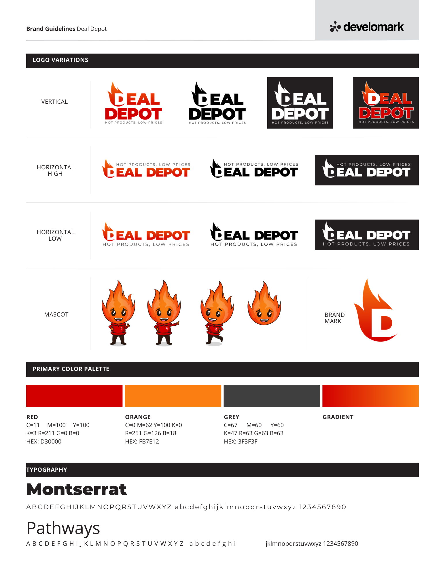
sample #4
An example of a recent brand guideline done for a home services business.
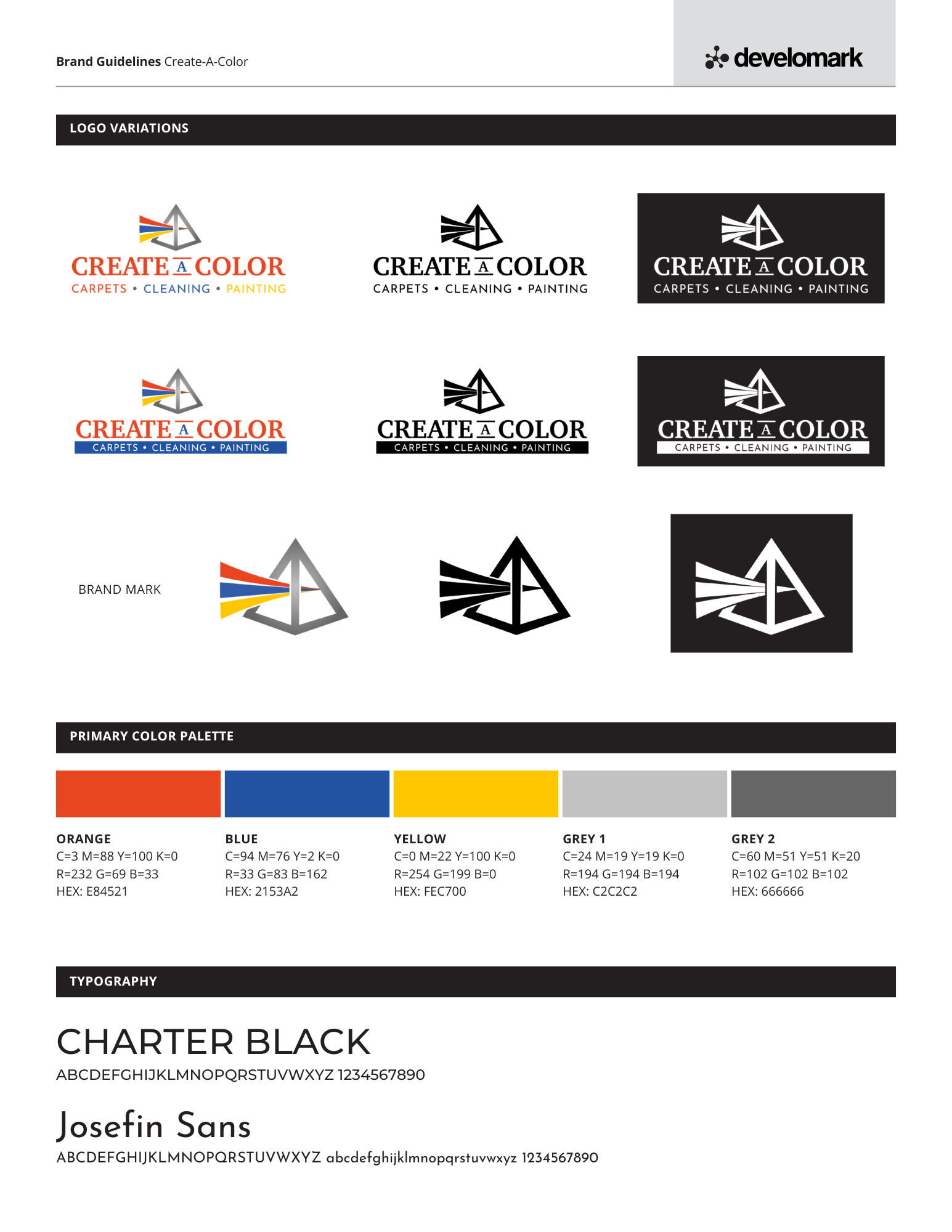
home services

full color
Good for use wherever you feel like it.

black
Good for use over a white background.

white
Good for use over a darker background.
sample #5
An example of a recent brand guideline done for a day care.
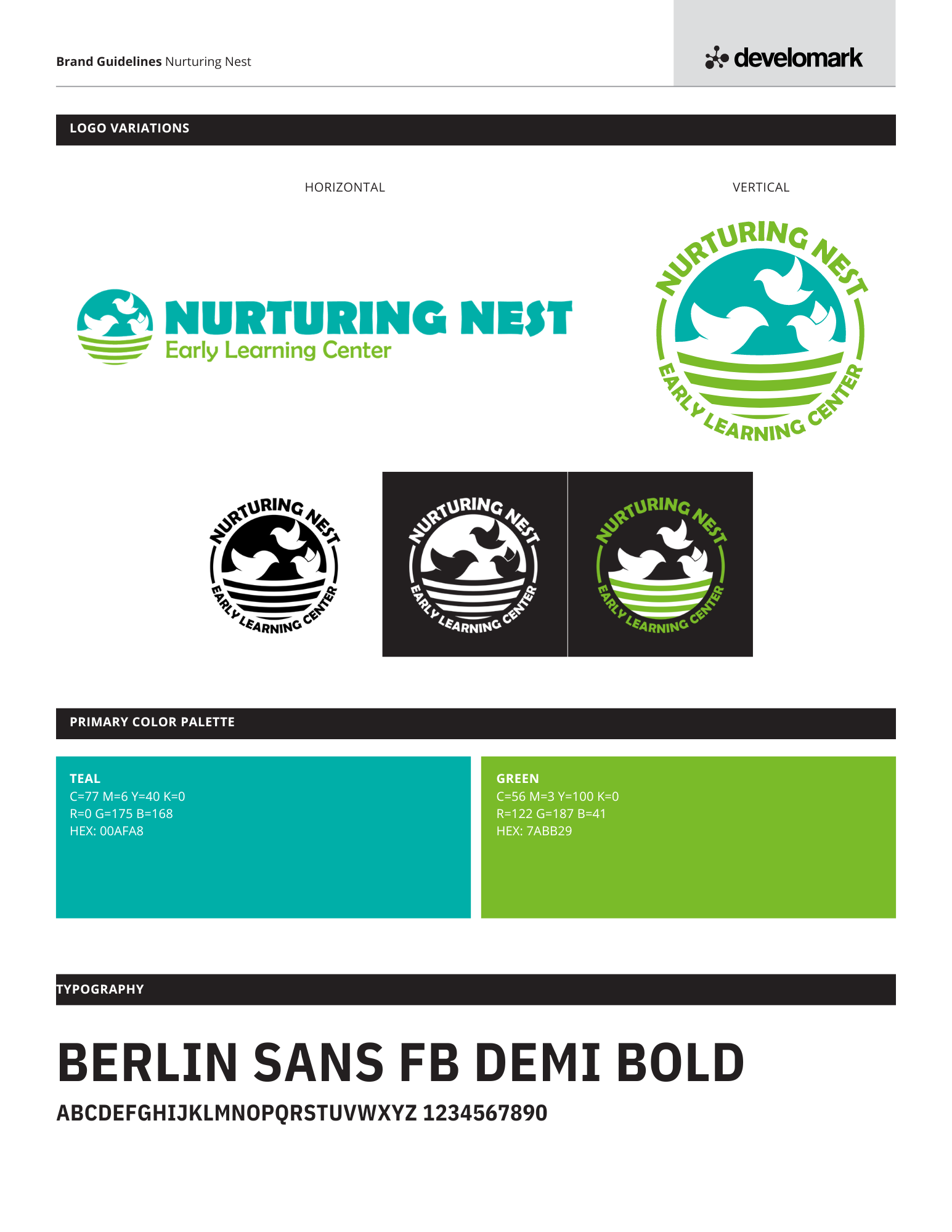
daycare:

full color
Good for use wherever you feel like it.

black
Good for use over a white background.

white
Good for use over a darker background.
sample #6
An example of a recent brand guideline done for a real estate brokerage firm.
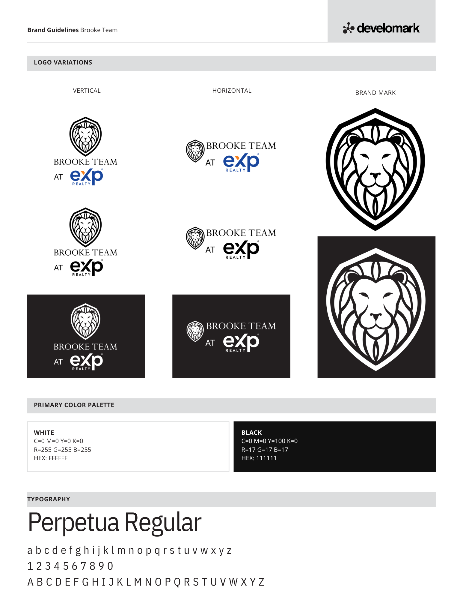
real estate firm:

full color
Good for use wherever you feel like it.

black
Good for use over a white background.

white
Good for use over a darker background.
extra, Extra
our seo approach
Get a behind the scenes look at how we optimize SEO results and performance in less than 300 seconds.

"What set Develomark apart was their attentive approach—they really listened, understanding our unique position in the industry as a company that traditionally didn’t prioritize marketing. They recognized our need to showcase our products and provided an effortless solution, conveniently photographing our inventory at their nearby location and ensuring they were ready to feature new additions at a moment's notice.
Develomark's team didn't just serve as our web designers; they became an extension of our brand, visiting our facilities to capture the essence of our workspace, embedding authenticity into our digital domain. They were adaptable, ready to engage with us on-site for any immediate needs or updates."
Sean, PPI Gas Distribution, Inc